Read Our Blogs
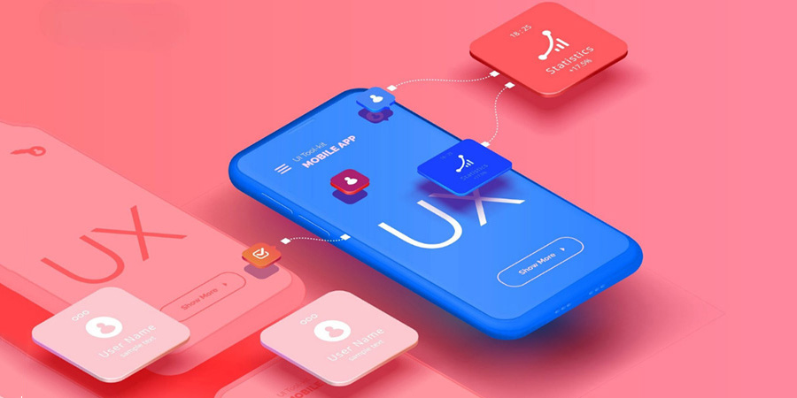
The Role of UX/UI Design in Web Development
In today’s digital world, building a website is no longer just about writing clean code or using the latest frameworks. What truly sets a successful website apart is how it feels, functions, and connects with users. This is where UX (User Experience) and UI (User Interface) design play a transformative role. Together, they determine how enjoyable, intuitive, and impactful a website becomes.
In this blog, we will explore why UX/UI design is crucial for web development and how it shapes the overall experience of modern web users.
What Is UX/UI Design?
UX (User Experience)
- UX is all about the overall experience a user has while interacting with a website. It focuses on:
- How easy the website is to navigate
- How fast users find what they need
- How smooth and satisfying the journey feels
UX designers conduct research, create user personas, map user journeys, and test the product to ensure everything flows seamlessly.
UI (User Interface)
- UI deals with how the website looks and feels visually. It covers:
- Colors
- Typography
- Layout
- Buttons, forms, and interactive elements
A well-designed UI ensures that users not only enjoy the look of the website but also find it clear and easy to use.
Why UX/UI Design Matters in Web Development?
1. First Impressions Matter
A visitor decides within 0.05 seconds whether they want to stay on a website.
A clean, visually appealing UI paired with intuitive UX can instantly grab attention and build trust.
2. Improved Usability
- Good UX ensures that the user can navigate the website effortlessly:
- Clear menus
- Predictable layout
- Consistent design patterns
When users find what they need quickly, they are more likely to stay longer.
3. Boosts Conversion Rates
- A well-designed UI directs users' attention toward important actions such as:
- Signing up
- Buying a product
- Filling a form
Good UX reduces friction, making tasks easier and increasing conversion rates.
4. Enhances Brand Identity
Consistent colors, fonts, and visual elements make your website feel professional and memorable. Strong UI design reinforces brand values and helps you stand out in a competitive market.
5. Mobile-Friendly Experience
- A huge portion of users browse through mobile devices. UX/UI design ensures:
- Responsive layouts
- Touch-friendly buttons
- Optimized content for small screens
This leads to better engagement and higher rankings on search engines.
6. Saves Time and Reduces Costs
- Investing in UX/UI early prevents costly redesigns later. A user-centered approach helps identify problems before development begins, saving:
- Time
- Resources
- Budget
How UX/UI and Web Development Work Together
- Web developers and designers collaborate closely to create a complete product. Here’s how:
- UX Designers plan the user flow and structure.
- UI Designers create the visual elements.
- Developers bring the designs to life using code.
This teamwork ensures the final website is both functional and beautiful.
UX/UI design is no longer optional—it is a core component of modern web development. A website with great visual appeal but poor usability will fail just as quickly as a functional website with no design appeal.
Build Your Digital Presence with EFD Web Development
Best Wishes
EFD Group
Division | Web Development

How to Build a Strong Web Developer Portfolio (Step-by-Step Guide for 2025)
Whether you are a beginner looking for your first client or an experienced coder aiming to level up your career, your web developer portfolio is your most powerful tool. It is more than just a collection of projects — it is your digital identity, your resume, and your personal brand rolled into one.
In this guide, we will walk you through how to build a strong web developer portfolio that truly stands out in 2025.
Why Your Portfolio Matters?
Think of your portfolio as a showcase of your skills — not just in coding, but also in creativity, problem-solving, and attention to detail.
- Employers and clients often look at your portfolio before they even read your resume. A great one can:
- Make you stand out from other developers.
- Prove your technical abilities with real examples.
- Demonstrate your design sense and attention to user experience.
- Help you land freelance clients or full-time jobs faster.
Step 1: Choose the Right Platform
- Before you start building, decide where to host your portfolio. Some popular options include:
- GitHub Pages – Great for showcasing code and personal projects.
- Netlify or Vercel – Perfect for deploying custom web apps easily.
- WordPress or Webflow – Ideal if you want more design flexibility.
- Custom Domain (yourname.dev or yourname.com) Makes your brand look professional.
Step 2: Highlight Your Best Projects
Your projects are the heart of your portfolio. Choose 3–6 quality projects that reflect your strongest skills and problem-solving abilities.
- For each project, include:
- A short description (what the project does and why you built it)
- Tech stack (languages, frameworks, tools used)
- Screenshots or demo videos
- A live link (if hosted online)
- GitHub repository link (for employers to review your code)
Step 3: Showcase Your Design & UX Sense
Even if you’re more of a backend developer, good design and user experience matter. Your portfolio should be clean, modern, and easy to navigate.
- Keep in mind:
- Use a consistent color palette and typography.
- Ensure it’s mobile-friendly.
- Add smooth animations or transitions to impress visitors.
- Keep your content short, readable, and professional.
Step 4: Include an “About Me” Section
This is where you let your personality shine!
Share your journey — what got you into web development, what drives you, and what kind of projects excite you.
- You can also include:
- A professional headshot
- A short bio in your own voice
- Your areas of expertise
- Links to social media (LinkedIn, GitHub, Twitter, etc.)
Step 5: Add Testimonials or Case Studies
If you have worked with clients or teams, add a few testimonials. Real feedback builds trust.
- For each client project, consider writing a short case study that covers:
- The client’s problem
- Your approach and solution
- The results or impact
This turns your portfolio into a story-driven showcase instead of a static gallery.
Step 6: Make It Interactive
- Include engaging elements like:
- A contact form for inquiries
- Downloadable resume
- Live demos for projects
- Blog section (optional, but great for SEO and thought leadership)
Step 7: Optimize for SEO & Performance
Your portfolio should not only look great it should also perform well.
- Check for:
- Fast loading speed (optimize images, use lazy loading)
- Proper meta titles and descriptions
- Clear navigation structure
- Secure HTTPS connection
This helps potential clients find you through search engines and creates a smooth user experience.
Step 8: Keep It Updated
Your portfolio isn’t a one-time project — it is an evolving showcase. Regularly update it with new work, skills, and blog posts to show that you’re active and growing.
You can also include a “What I’m Learning” section to reflect your curiosity and commitment to growth.
A strong web developer portfolio doesn’t just display what you have done — it tells the story of who you are as a developer. Keep it professional, authentic, and up-to-date, and it will open doors to endless opportunities — whether you’re looking for clients, a new job, or collaborations.
Build Your Digital Presence with EFD Web Development
Best Wishes
EFD Group
Division | Web Development
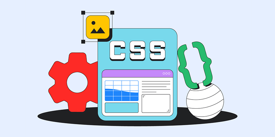
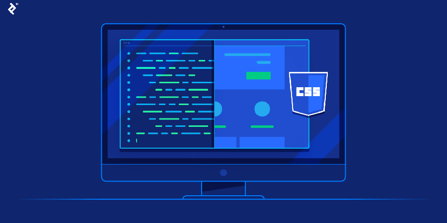
Getting Started with CSS: Styling Your First Webpage
When you build a website, HTML is responsible for the content and structure — like paragraphs, headings, images, and links. But how do you make it look attractive? That’s where CSS comes in.
This post is your beginner-friendly introduction to CSS and how it helps you style a webpage.
What is CSS and Why Is It Important?
CSS stands for Cascading Style Sheets, and it is the language used to style and design HTML content.
Imagine HTML as the skeleton of your site — CSS is the design, makeup, and fashion that makes it beautiful and usable. It controls everything from fonts and colors to spacing, layout, and responsiveness.
How CSS Works
- CSS works by selecting HTML elements (like headings or buttons) and applying visual rules to them — things like:
- What font and color the text should be
- How big or small things should appear
- How elements should be spaced or aligned
- What happens when a user hovers over a button or clicks a link
These styles can be added directly inside HTML, inside a style block at the top of the page, or (ideally) linked as a separate CSS file for better organization.
Styling Your First Webpage: The Big Picture
- Here is what you would typically do when styling your first webpage:
- 1. Start with a simple HTML page
Your base layout includes things like a header, paragraph, and maybe a button or image. - 2. Add a STYLE section or a separate CSS file
This is where you write rules to style your content — such as making the background light blue, changing the font, or centering text. - 3. Apply rules to HTML elements
For example, you might make your headings dark blue, set your text to a clean sans-serif font, and round the corners of your buttons. - 4. Test it in your browser
Save your file and open it in a browser to see your changes. Try editing styles and refreshing to see the effects.
What You Can Style With CSS
- CSS can control a wide range of design elements:
- Typography: Font family, size, weight, letter spacing
- Colors: Text color, background color, link colors
- Spacing: Margins, padding, line height
- Layout: Positioning, alignment, columns, grids
- Interactivity: Hover effects, transitions, animations
- Responsiveness: Media queries to adapt to different screen sizes
Even with basic knowledge, you can dramatically change the look of a page with just a few style rules.
Why CSS Is Beginner-Friendly
CSS is forgiving you can start small and gradually build up your skills. You don’t need to know programming logic or complex syntax to use it effectively. It is visual — you instantly see your changes in the browser, which makes learning fast and rewarding.
CSS is what brings life and personality to your webpages. With just a little effort, you can go from a plain, text-only site to something sleek, stylish, and professional-looking. Whether you are creating a personal blog, a portfolio, or experimenting for fun, learning CSS is one of the best ways to express creativity as a web developer.
Build Your Digital Presence with EFD Web Development
Best Wishes
EFD Group
Division | Web Development

How AI Is Transforming Web Development
The landscape of web development is changing rapidly and Artificial Intelligence (AI) is at the center of that transformation. From automated coding to personalized user experiences, AI is no longer a futuristic concept; it's a present-day reality that's reshaping how websites are designed, built, and optimized.
In this blog, we explore how AI is revolutionizing web development, the tools driving this change, and what it means for developers and businesses alike.
1. AI-Powered Code Generation
- AI tools like GitHub Copilot, CodeWhisperer, and ChatGPT are helping developers write cleaner and faster code by:
- Suggesting entire lines or blocks of code
- Auto-completing functions and variables
- Refactoring existing code for performance or clarity
This means developers can focus more on logic and architecture, and less on repetitive syntax.
2. Smarter Debugging & Error Detection
- AI-based debugging tools can now detect issues before you even run your code. These tools:
- Analyze code patterns for potential bugs
- Recommend fixes in real time
- Learn from past errors to improve future suggestions
This reduces downtime and makes development more efficient.
3. AI in Design & UX
- AI is not just for developers — designers are also leveraging it for smarter user experiences:
- AI-generated UI layouts based on content type and brand
- Predictive UX that adapts to user behavior
- Tools like Uizard, Figma AI, and Adobe Sensei that assist in creating responsive and intuitive designs
This enables faster prototyping and more personalized interfaces.
4. Personalization & User Behavior Tracking
- AI allows websites to adapt in real-time to each user:
- Personalized content recommendations
- Smart product suggestions (used by e-commerce giants)
- Chatbots that learn from past interactions
This leads to higher engagement, more conversions, and a better overall experience.
5. AI-Driven Security
- Cybersecurity is becoming increasingly complex — but AI is helping web developers stay ahead:
- Real-time threat detection using pattern recognition
- Automated response to DDoS attacks or suspicious behavior
- AI-powered authentication systems (biometric, behavioral, etc.)
AI helps ensure secure and resilient web apps, even at scale.
6. Automating Testing & Deployment
- AI is also streamlining the DevOps side of web development:
- Automated testing frameworks that evolve with your codebase
- CI/CD pipelines that adapt based on test results
- Tools like Testim, Mabl, and Percy that use machine learning for visual regression testing
This reduces manual effort and shortens deployment cycles.
7. Voice & Conversational Interfaces
- Web development is moving beyond screens with the rise of:
- Voice UI integration using tools like Dialogflow, Amazon Lex, or Wit.ai
- AI-powered chatbots that handle support, sales, and onboarding
These interfaces are transforming how users interact with websites, especially in mobile-first and accessibility-conscious environments.
8. Backend Optimization with AI
- AI is helping developers optimize backend systems:
- Intelligent load balancing
- Predictive caching
- Database query optimization
AI algorithms can predict traffic patterns, scale resources, and improve performance all automatically.
What This Means for Web Developers
Web developers are not being replaced — they're being augmented by AI.
- To stay ahead, developers should:
- Learn how to work with AI tools (like ChatGPT, Copilot, Figma AI)
- Understand AI integration via APIs
- Keep security and ethics in mind when building intelligent systems
The Future of AI in Web Development
- We are just scratching the surface. In the next few years, we may see:
- Fully AI-generated websites
- No-code platforms enhanced by AI logic
- AI that understands business goals and builds solutions accordingly
As AI matures, it will become a core collaborator in the development process not just a tool.
AI is transforming web development making it faster, smarter, and more user-centric than ever. Whether you are a solo developer or part of a large team, integrating AI into your workflow is not optional anymore — it is essential.
Build Your Digital Presence with EFD Web Development
Best Wishes
EFD Group
Division | Web Development
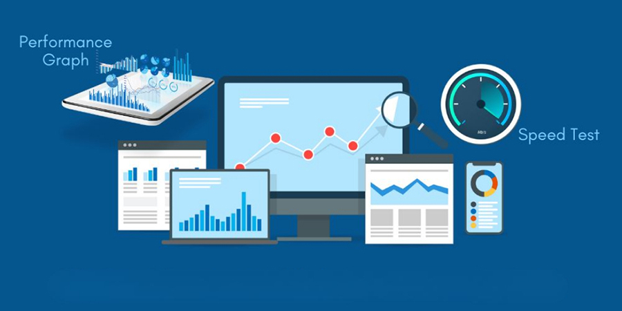
Web Performance Optimization: Tips to Speed Up Your Site
In today's fast-paced digital world, website speed is not a luxury — it is a necessity. A slow-loading site can frustrate users, increase bounce rates, and seriously hurt your SEO rankings. Whether you're running an eCommerce store, a blog, or a portfolio site, optimizing your website’s performance should be a top priority.
In this post, we will cover practical, actionable tips to speed up your site and keep visitors (and Google) happy.
Why Web Performance Matters?
- User Experience: Users expect websites to load in under 3 seconds. Any longer, and they’ll likely leave.
- SEO: Google uses page speed as a ranking factor. Faster sites rank better.
- Conversions: A delay of just 1 second in page load time can reduce conversions by 7%.
- Mobile Users: With most traffic coming from mobile, speed is even more critical on slower networks.
10 Practical Tips to Optimize Your Website Performance:
1. Enable Compression
Use Gzip or Brotli compression to reduce the size of your HTML, CSS, and JavaScript files. This minimizes the amount of data transferred to the browser.
2. Optimize Images
- Large, uncompressed images are a top cause of slow websites.
- Use modern formats like WebP
- Resize images to match display size
- Use tools like TinyPNG, ImageOptim, or built-in tools in your CMS
3. Minify CSS, JavaScript, and HTML
Minification removes unnecessary characters (like spaces and comments) from your code.
- Tools:
- UglifyJS (for JS)
- CSSNano (for CSS)
- HTMLMinifier (for HTML)
4. Use a Content Delivery Network (CDN)
A CDN caches your content across multiple servers around the globe, reducing the time it takes to load content for users in different locations.
5. Leverage Browser Caching
When users visit your site, store static files (like images, JS, and CSS) in their browser cache so they don’t have to be downloaded again on the next visit.
6. Reduce HTTP Requests
- Each file (image, CSS, JS) is an HTTP request. Reduce these by:
- Combining CSS & JS files
- Using CSS sprites
- Minimizing the use of third-party scripts
7. Implement Lazy Loading
Only load content (like images, videos, iframes) when they are needed — i.e., when the user scrolls down to them.
8. Use Efficient Fonts
- Fonts can be surprisingly heavy. To optimize:
- Use system fonts when possible
- Choose modern, optimized web fonts
- Only include the character sets you need
9. Reduce Server Response Time
- A slow server = a slow website. You can improve this by:
- Upgrading to a better hosting provider
- Using caching (e.g., Redis, Varnish)
- Optimizing your database (especially for CMS like WordPress)
10. Audit with Performance Tools
- Regularly check your website’s speed and performance using:
- Google PageSpeed Insights
- GTmetrix
- Lighthouse (built into Chrome DevTools)
These tools provide tailored suggestions to help you pinpoint what’s slowing your site down.
Website performance optimization is not a one-time task — it is an ongoing process. By implementing the tips above, you’ll deliver a faster, smoother experience for your users and gain a competitive edge in SEO and conversions.
Build Your Digital Presence with EFD Web Development
Best Wishes
EFD Group
Division | Web Development
Top CSS Tips to Make Your Website Stand Out
When it comes to web design, CSS is the secret sauce that transforms a basic structure into something visually engaging. Whether you're working on a portfolio, business site, or admin dashboard, thoughtful CSS can elevate your entire user experience.
Here are some top CSS tips to help your website stand out from the rest.
1. Use CSS Variables for Consistency
CSS variables allow you to define reusable values like colors, font sizes, and spacing. This makes your styles consistent and easy to update across your entire project. They're especially helpful when managing themes like light and dark mode.
2. Pay Attention to Typography
Typography has a huge impact on readability and design. Stick to a small number of clean, web-safe fonts. Focus on line spacing, font size, and letter spacing to improve the overall visual hierarchy. Good typography instantly makes a site feel more polished and professional.
3. Add Subtle Animations and Transitions
Smooth transitions and small hover effects can add life to your website. These don’t have to be flashy—just enough to guide users or create a sense of interactivity. Subtle animations make your site feel more modern and dynamic without overwhelming the user.
4. Use Flexbox and Grid for Layout
Instead of relying on outdated layout methods, use Flexbox and CSS Grid. These tools help create responsive, flexible layouts that adapt to different screen sizes with ease. They also keep your code cleaner and easier to maintain.
5. Design Mobile-First
With the majority of web traffic coming from mobile devices, it's essential to start your design with smaller screens in mind. Mobile-first design ensures your site looks great and functions well on any device. Then you can scale up for larger screens using media queries.
6. Customize UI Elements
Want to add a unique touch to your site? Consider customizing scrollbars, buttons, and form inputs. Small UI enhancements can set your site apart and show attention to detail, which users appreciate. Just be sure not to overdo it—keep things functional and user-friendly.
7. Keep Your CSS Clean and Organized
Well-organized CSS is easier to read, update, and scale. Use consistent naming conventions, comment where needed, and avoid deeply nested rules. Whether you are working solo or handing off to another developer, clean code always saves time.
Bonus Tip: Use Frameworks Wisely
CSS frameworks like Bootstrap or Tailwind can speed up development, but don’t let them limit your creativity. Customize components and add your own styles to avoid that “template” look and make your site feel truly unique.
CSS is more than just styling—it's an essential part of creating a memorable user experience. By applying these tips, you can design websites that are not only functional but visually impressive. Whether you're a beginner or experienced developer, smart use of CSS is what truly makes your website stand out.
Build Your Digital Presence with EFD Web Development
Best Wishes
EFD Group
Division | Web Development

How to Build a Responsive Website from Scratch (Beginner’s Guide)?
In today’s mobile-first world, building a website that works seamlessly across all devices — desktops, tablets, and smartphones — is not optional, it is essential. A responsive website ensures that your layout, text, images, and other elements automatically adjust to fit different screen sizes.
If you are just getting started with web development, this guide will walk you through how to build a responsive website from scratch, step by step.
What Is a Responsive Website?
A responsive website adapts its layout and design to provide an optimal viewing experience on any device. This means users don’t have to zoom, scroll sideways, or deal with awkward formatting — whether they are using a phone or a desktop computer.
- Responsive design uses techniques like:
- Flexible layouts
- Scalable images
- Media queries in CSS
- Mobile-first design principles
Tools You will Need
- Before you start building, make sure you have the basic tools and knowledge:
- A text/code editor (like Visual Studio Code or Sublime Text)
- A web browser for testing (Google Chrome, Firefox, etc.)
- Basic understanding of HTML & CSS
- Optional: familiarity with modern layout systems like Flexbox or CSS Grid
Step-by-Step: How to Build a Responsive Website
1. Plan Your Layout
- Start by outlining what your website needs:
- A header with logo and navigation
- A main section with content (text, images, etc.)
- A footer with links or copyright info
Sketching your layout on paper or using tools like Figma can help visualize how the design should adapt on smaller screens.
2. Write Your HTML and CSS Structure
Create the basic structure of your site with clean, semantic HTML, then use CSS to style the elements.
Use relative units (like %, em, rem) instead of fixed pixels wherever possible. This ensures that your layout adjusts smoothly across screen sizes.
3. Add Media Queries
Media queries in CSS allow your site to change layout or style rules based on the device’s screen size. For example, you can stack navigation links vertically on mobile, while keeping them horizontal on desktop.
- Some common breakpoints:
- Large desktops: 1200px and up
- Laptops/tablets: 768px – 1199px
- Mobile devices: 480px – 767px
Start with a mobile-first approach, styling your site for small screens first, then adding media queries to enhance the layout for larger devices.
4. Use Flexible Images and Grids
Make sure your images and layout containers can scale properly. Instead of setting fixed widths, use percentages or max-width: 100% to allow images to shrink as needed.
For layout, use Flexbox or CSS Grid, which are both responsive-friendly and make it easier to align items, create columns, or build complex layouts without media queries.
5. Test Across Devices
- Once your site is styled and media queries are in place, test it on different screen sizes:
- Use browser developer tools to simulate devices (Chrome DevTools is great for this)
- Open your site on actual devices — phone, tablet, and desktop
- Check if the text is readable, buttons are clickable, and no elements are overlapping or cut off
Building a responsive website from scratch may sound intimidating, but once you understand the key principles, it becomes second nature. By focusing on flexibility, mobile-first design, and clean code, you can create websites that look great everywhere. Whether you are building a personal blog, a portfolio, or a business site, responsiveness is what will keep your users engaged — no matter how they access your content.
Build Your Digital Presence with EFD Web Development
Best Wishes
EFD Group
Division | Web Development
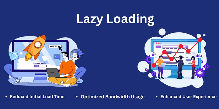
Lazy Loading Images: What, Why & How?
When it comes to building fast, user-friendly websites, images often play a big role in slowing things down. But there’s a simple solution to help speed things up without sacrificing visual quality — lazy loading images.
In this post, we will explain What lazy loading is, Why it's important & How to easily implement it on your website
What is Lazy Loading?
Lazy loading is a technique that delays the loading of images until they are needed — typically when they’re just about to appear on a user’s screen.
Instead of loading every image on the page when it first opens (even the ones at the bottom that users might never scroll to), lazy loading waits until the user scrolls down to that part of the page. Only then does the image load.
Think of it like this:
You don’t turn on all the lights in your house at once — you turn them on only when you enter a room. That’s exactly how lazy loading works for images.
Why Should You Use Lazy Loading?
Lazy loading is not just a fancy trick — it has real benefits for your website performance and your visitors’ experience.
1. Faster Page Load Times:
Pages load quicker when fewer images load at the start. This makes your site feel smoother and more responsive.
2. Better User Experience:
Nobody likes waiting for a website to load. Lazy loading helps pages become interactive faster, which keeps visitors engaged
3. Saves Data for Mobile Users:
Visitors on mobile networks or limited data plans don’t have to download every image — only the ones they actually view.
4. Improves SEO:
Google favors websites that load quickly and offer a good user experience. Lazy loading can help improve your site’s rankings in search results.
How to Implement Lazy Loading?
There are a few ways to add lazy loading to your website, and the good news is — it’s easier than ever.
1. Use Built-In Features:
Many website platforms (like WordPress, Shopify, or Wix) have lazy loading built in. Check your settings or themes — it may already be turned on!
2. Use a Plugin:
If your platform does not support lazy loading out of the box, you can install a plugin or extension. There are many free and paid options available that handle all the work for you.
3. Talk to Your Developer:
If you work with a developer, ask them to add lazy loading for your images. It’s a small change that can make a big difference.
Best Practices for Lazy Loading
- Use clear image sizes to avoid page layout shifting.
- Add placeholder images or subtle animations while the real image loads.
- Test your site speed after enabling lazy loading to see the improvement.
Lazy loading images is a simple but powerful way to speed up your website, improve user experience, and boost your SEO. Whether you are running a blog, an online store, or a business site, it’s a smart move that pays off.
If you have not already, take a few minutes to set it up — your visitors (and your search rankings) will thank you.
Build Your Digital Presence with EFD Web Development
Best Wishes
EFD Group
Division | Web Development
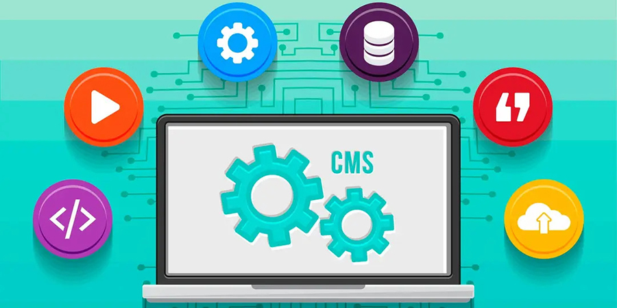
How to Choose the Right CMS for Your Business?
When building a professional website, one of the most critical decisions you'll make is choosing the right Content Management System (CMS). The CMS you select can impact your website’s performance, scalability, SEO, design flexibility, and even your day-to-day operations.
With so many CMS options available—like WordPress, Shopify, Webflow, Wix, Joomla, Magento, Drupal, and others—it can be overwhelming to choose the best one for your business.
In this blog, we will break down what a CMS is, why it matters, and how to choose the right CMS for your specific needs.
What Is a CMS?
A Content Management System (CMS) is a software platform that allows you to create, manage, and modify digital content on a website without needing to write code from scratch. Think of it as the "backend" of your website—the place where you log in, upload content, publish blog posts, update pages, and manage design elements.
Why Choosing the Right CMS Matters?
- The CMS you choose affects:
- Website speed and performance
- Security and data protection
- SEO capabilities
- User experience and design flexibility
- Integration with third-party tools
- Cost of setup and maintenance
- Ease of scaling as your business grows
Key Factors to Consider When Choosing a CMS
1. Your Business Goals
- Are you building:
- A blog or content-driven site?
- An e-commerce store?
- A portfolio or personal brand?
- A corporate or service-based site? Your end goal determines which CMS features are essential.
Example: Shopify is excellent for e-commerce, while WordPress is ideal for content-heavy sites.
2. Ease of Use
Do you or your team have technical experience? Some CMS platforms are beginner-friendly, while others require developer skills.
| CMS | Ease of Use | Tech Skill Needed |
|---|---|---|
| WordPress | Moderate | Low to Medium |
| Wix | Easy | None |
| Webflow | Moderate | Medium |
| Shopify | Easy | None |
| Drupal | Hard | High |
| Joomla | Moderate | Medium |
An optimized site is the difference between a bounce and a sale.
3. Scalability
Choose a CMS that can grow with your business. If you are planning to expand your site with more pages, features, or traffic, make sure the platform can handle that.
Tip: WordPress and Drupal are highly scalable for larger projects.
4. Security
Look for a CMS with strong security features, regular updates, and community or developer support. E-commerce sites must ensure PCI compliance and customer data protection.
5. Budget
- Different CMS platforms come with different costs:
- Open-source CMS like WordPress or Joomla are free but require hosting and possible plugin/theme purchases.
- Hosted CMS like Wix or Shopify include hosting but charge monthly fees.
6. SEO Features
- Different CMS platforms come with different costs:
- Customizable meta tags
- Clean URLs
- Image optimization
- Fast loading speed
- Mobile responsiveness
Top SEO-friendly CMSs: WordPress, Webflow, Shopify (with apps), and Joomla.
7. Integration & Plugins
- Make sure your CMS supports integration with:
- Email marketing tools (Mailchimp, ConvertKit)
- CRMs (HubSpot, Salesforce)
- Payment gateways (PayPal, Stripe)
- Analytics tools (Google Analytics, Hotjar)
WordPress has 55,000+ plugins, making it the most customizable.
There is no one-size-fits-all answer. The best CMS depends on your business goals, budget, technical skills, and future growth plans.
Build Your Digital Presence with EFD Web Development
Best Wishes
EFD Group
Division | Web Development
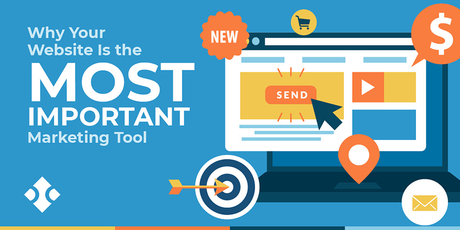
Why Your Website Is the Most Important Part of Your Marketing?
In today’s digital-first world, your website is no longer just a digital business card — it is the foundation of your brand, your most powerful marketing asset, and often your first (and only) chance to make an impression.
Whether you are running a local business or a global brand, your website is where your customers land, learn, and ultimately decide to trust you.
Let’s break down why your website is the heart of your marketing strategy:
1. It’s Your 24/7 Salesperson
Unlike your team, your website never sleeps. It's available 24/7, helping potential customers learn about your services, explore your products, and contact you — even when you're offline.
A well-optimized website works around the clock to convert visitors into leads and leads into loyal customers.
2. First Impressions Happen Here
Most people will discover your business online first — through a Google search, a social media link, or an ad. And what do they do next? They check your website.
In just a few seconds, visitors will decide if you're trustworthy, professional, and worth their time. A modern, clean, fast, and mobile-friendly site instantly builds credibility. An outdated or broken one? That does the opposite.
3. It is the Core of All Marketing Channels
- Whether you’re investing in:
- SEO
- Google Ads
- Email marketing
- Social media
- Influencer campaigns
- Offline promotions ..all of them lead back to your website.
That makes your site the central hub of your entire marketing ecosystem.
4. It Drives Conversions
Your marketing campaigns might attract visitors — but your website turns them into paying customers. Clear calls-to-action (CTAs), well-placed forms, chatbots, and simple navigation all guide users to take action.
An optimized site is the difference between a bounce and a sale.
5. Mobile Experience Is Non-Negotiable
Over 60% of internet traffic is now on mobile. If your website isn’t responsive and user-friendly on phones or tablets, you’re losing business — period.
Responsive design is no longer a feature — it’s a requirement.
6. It’s Measurable & Testable
- Unlike traditional marketing, your website performance is fully trackable. With tools like Google Analytics, Hotjar, and Search Console, you can see:
- Where users come from
- What they click on
- Where they drop off
- What content converts best
This data helps you fine-tune your marketing strategy in real time.
7. It Builds Brand Trust
- A strong website reflects a strong brand. With the right visuals, tone, and user experience, your site tells visitors:
- Where users come from
- What they click on
- Where they drop off
- What content converts best
Trust builds loyalty — and loyalty drives growth.
8. It is Your Competitive Advantage
In a world where everyone has a presence online, your website can set you apart. With custom design, faster load times, better content, and smart UX — your site becomes more than just a page, it becomes a powerful business tool.
A better website = a better impression = more business.
9. It's Scalable and Adaptable
Unlike printed materials or ads, your website can evolve with your business. Want to launch a new service? Add a landing page. Running a sale? Add a banner. Shifting your strategy? Update your messaging.
Your website grows as your business grows.
10. It’s the Foundation of Digital Credibility
Today, people judge your credibility by your website. No site or a poorly designed one can raise doubts about your legitimacy. A clean, professional, up-to-date site shows you care about your brand — and your customers.
Your website is not just part of your marketing — it is your marketing. Every campaign you run eventually leads users back to your site. If it does not deliver a great experience, nothing else will matter.
Build Your Digital Presence with EFD Web Development
Best Wishes
EFD Group
Division | Web Development
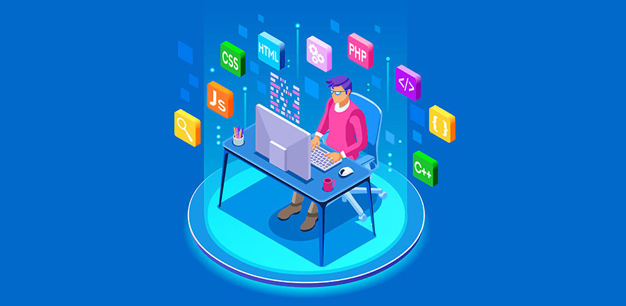
Top 10 Free Tools Every New Web Developer Should Use
Starting out in web development? The good news is you don’t need to invest in expensive software or platforms to get going. There are plenty of powerful and free tools that can help you code, design, debug, and deploy websites with ease.
Whether you’re learning the ropes or working on your first few projects, these tools will supercharge your workflow and help you become a more efficient, confident developer.
Let’s dive into the Top 10 free tools every new web developer should use:
1. Visual Studio Code (VS Code)
A lightweight yet powerful code editor developed by Microsoft. It supports multiple languages, has a huge extension library, and includes built-in Git support.
Best for: Writing, editing, and managing code
2. GitHub
GitHub is the world’s most popular platform for version control using Git. It’s where you store your code, collaborate with others, and manage open-source or personal projects.
Best for: Code collaboration and version control
3. CodePen
An online playground for HTML, CSS, and JavaScript. Perfect for quick experiments, animations, and front-end prototypes you can instantly preview in the browser.
Best for: Rapid prototyping and learning front-end
4. FreeCodeCamp
A completely free online platform offering coding lessons, projects, and certifications in web development and more.
Best for: Learning web development step by step
5. Google Chrome DevTools
Built into every Chrome browser, DevTools let you inspect, edit, and debug your website in real time. You can also test responsiveness and performance.
Best for: Debugging and testing in-browser
6. Figma
A free collaborative design tool for wireframing, UI/UX design, and prototyping. It’s especially useful when working with designers or planning layout structure.
Best for: Designing and collaborating on web layouts
7. Netlify
A simple and powerful hosting platform for static websites. With drag-and-drop deployment, Git integration, and free SSL, it's a top choice for front-end developers.
Best for: Hosting your web projects for free
8. W3Schools & MDN Web Docs
Two of the most trusted learning resources for developers. W3Schools is beginner-friendly, while MDN Web Docs (by Mozilla) offers in-depth, reliable documentation.
Best for: Learning syntax and finding quick references
9. Canva
While not strictly for developers, Canva is a great free tool for quickly creating visuals, banners, and mockups without needing advanced design skills.
Best for: Creating website graphics and marketing materials
10. Stack Overflow
Every developer’s best friend. Chances are, if you run into a coding problem, someone has asked (and answered) it on Stack Overflow.
Best for: Troubleshooting and finding coding solutions
Starting with the right set of tools can make a huge difference in how fast you learn and how confidently you build. These 10 tools are free, beginner-friendly, and widely used in the industry—so you are setting yourself up for success from day one.
Build Your Digital Presence with EFD Web Development
Best Wishes
EFD Group
Division | Web Development

The Future of Web Development: Trends to Watch in 2025
Web development is evolving faster than ever. From AI-powered interfaces to immersive user experiences, developers are pushing boundaries and redefining what’s possible online. In this post, we’ll explore the top trends shaping the future of web development—and how you can stay ahead of the curve.
Top 7 Digital Marketing Strategies:
1. AI & Automation in Web Design
Artificial intelligence is no longer just a buzzword. Tools like Copilot and ChatGPT are helping developers write cleaner code, generate content, and even design layouts.
2. Mobile-First & Responsive Design
With mobile traffic dominating the web, responsive design isn’t optional—it’s essential. Frameworks like Bootstrap and Tailwind CSS make it easier than ever to build fluid, mobile-friendly layouts.
3. Progressive Web Apps (PWAs)
PWAs combine the best of web and mobile apps. They’re fast, reliable, and work offline—perfect for users in low-connectivity areas.
4. Motion UI & Microinteractions
Subtle animations and transitions can elevate the user experience. Motion UI libraries help you add flair without sacrificing performance.
5. Accessibility & Inclusive Design
Designing for everyone isn’t just ethical—it’s smart. Accessible websites reach wider audiences and perform better in search rankings.
6. Jamstack & Headless Architecture
Modern web development is moving toward Jamstack and headless CMS tools like Strapi or Contentful—offering faster load times, better scalability, and stronger security by separating frontend from backend.
Web development is more than just code—it’s about crafting experiences. Whether you're a seasoned developer or just starting out, staying curious and adaptable is key. Keep learning, keep building, and keep pushing the web forward.
Build Your Digital Presence with EFD Web Development
Best Wishes
EFD Group
Division | Web Development

Top 7 Digital Marketing Strategies Every Business Needs in 2025
Stay ahead in the ever-evolving world of digital marketing with our expert insights, tips, and strategies. Whether you’re a business owner, marketer, or enthusiast, our blog covers everything from SEO and social media trends to content marketing and paid advertising. We’re here to help you navigate the digital landscape, grow your online presence, and turn clicks into customers. Dive into our latest articles and discover practical advice that you can apply to boost your brand and achieve real results.
Top 7 Digital Marketing Strategies:
1. AI-Powered Personalization
EFD Group uses AI to create personalized campaigns that boost engagement and drive results.
2. Voice Search Optimization
EFD Group optimizes content for voice search, aligning with how users speak to Siri, Alexa, and Google Assistant.
3. Video Marketing Dominance
EFD Group crafts engaging video strategies—reels, tutorials, live streams—to boost brand recall and build trust.
4. Omnichannel Marketing
EFD Group ensures your brand message stays consistent across all platforms—social media, email, and search—for a seamless customer experience.
5. SEO with a Focus on E-E-A-T
SEO isn’t just about keywords—it’s about trust. EFD Group Digital Marketing builds content that reflects Experience, Expertise, Authoritativeness, and Trustworthiness (E-E-A-T), so your website ranks higher and earns credibility.
6. Influencer & Micro-Influencer Collaborations
Authenticity is everything in 2025. EFD Group Digital Marketing connects brands with influencers who align with their mission, ensuring organic growth and community trust.
7. First-Party Data Strategy
As privacy rules evolve, relying on third-party cookies is no longer an option. EFD Group Digital Marketing helps brands build and activate first-party data.